Topic Toggle
I made an app for my grandma.
Brazilian Steakhouses
When I was in my early 20s, my Grandparents Jean and John Lyman took me to a Brazilian steakhouse for the first time. At the restaurant, there's a huge central hub where people are grilling a bunch of meats. Servers come around with meat skewers and will slice off meat for anyone who wants some. I loved it, and it became a tradition for the grandparents to take us to these steakhouses on some special occasions.
Here's a photo of when they took my family out to celebrate my Master's graduation.

How do the servers know who wants more meat? The stakehouses have some sort of little token on the table. One side is a 'more meat please' side, and one is a 'no meat now' side. You can flip it over to indicate whether you want more.
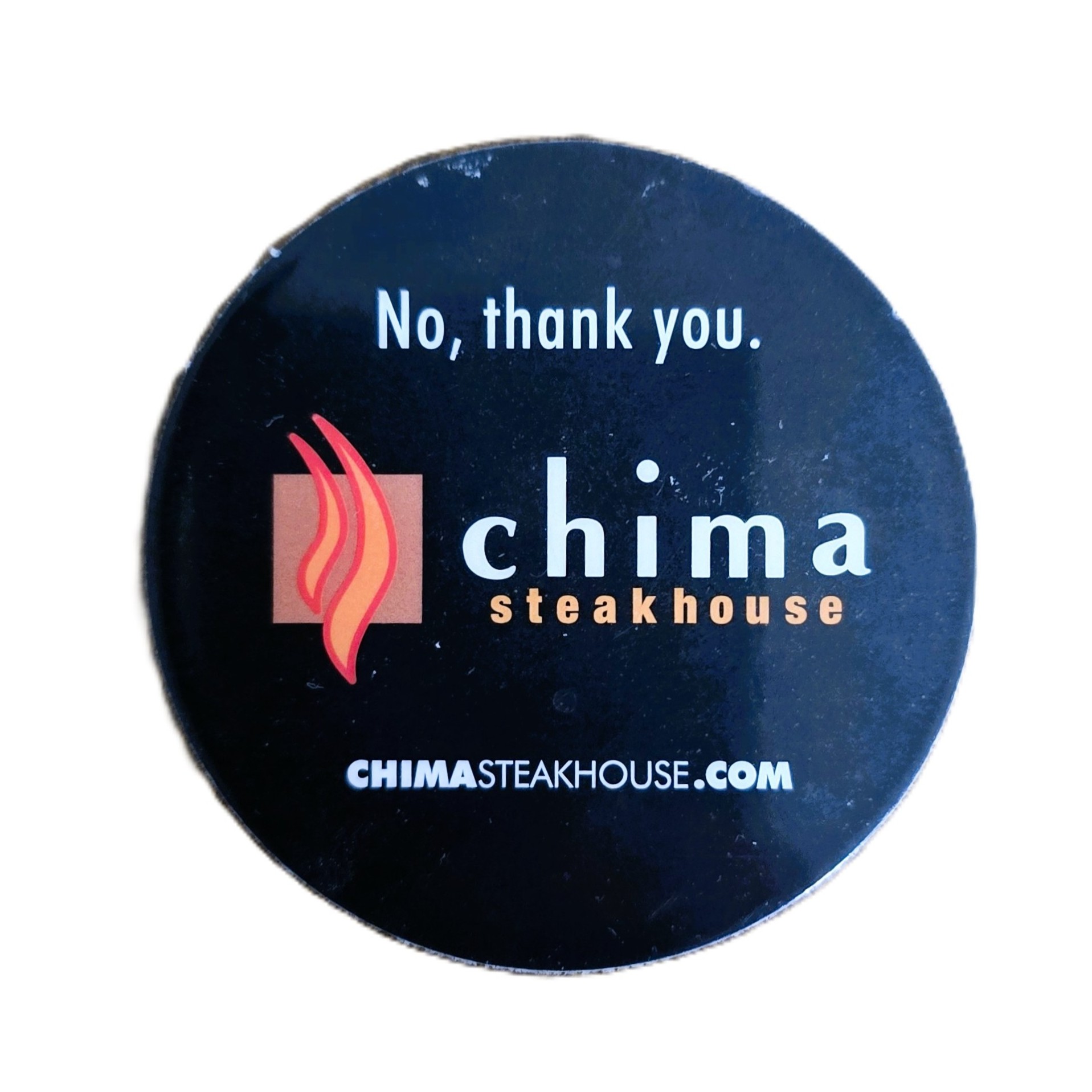
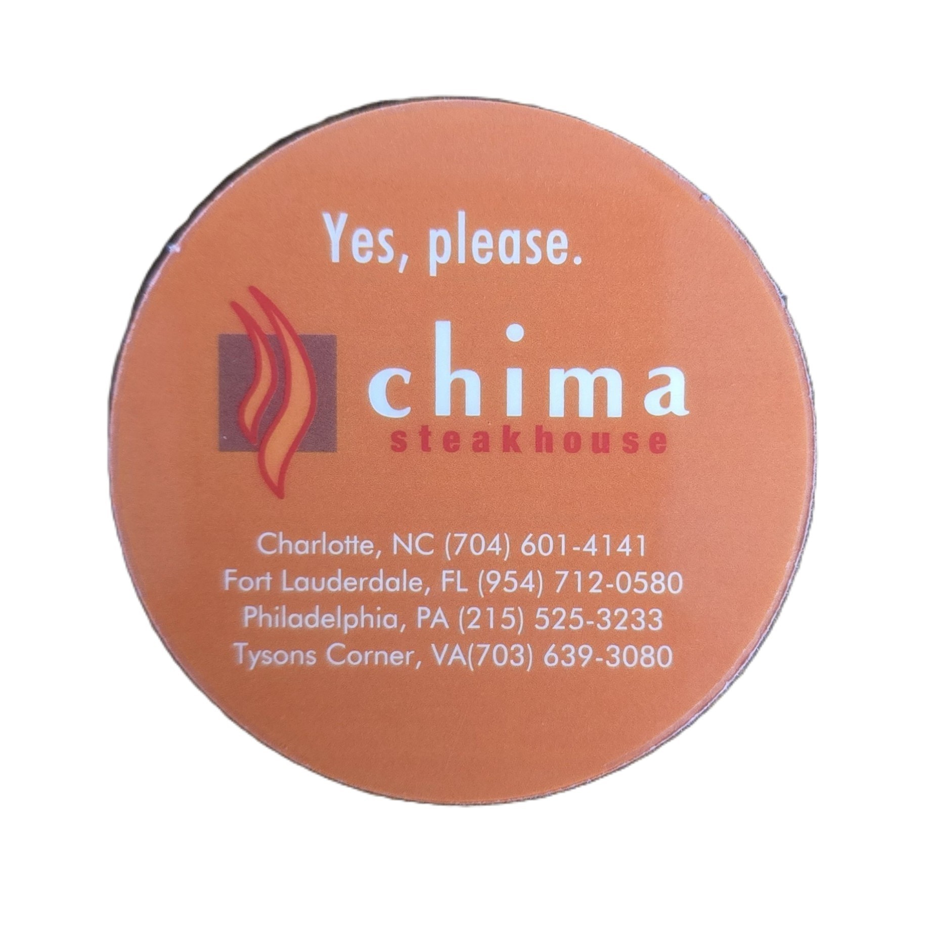
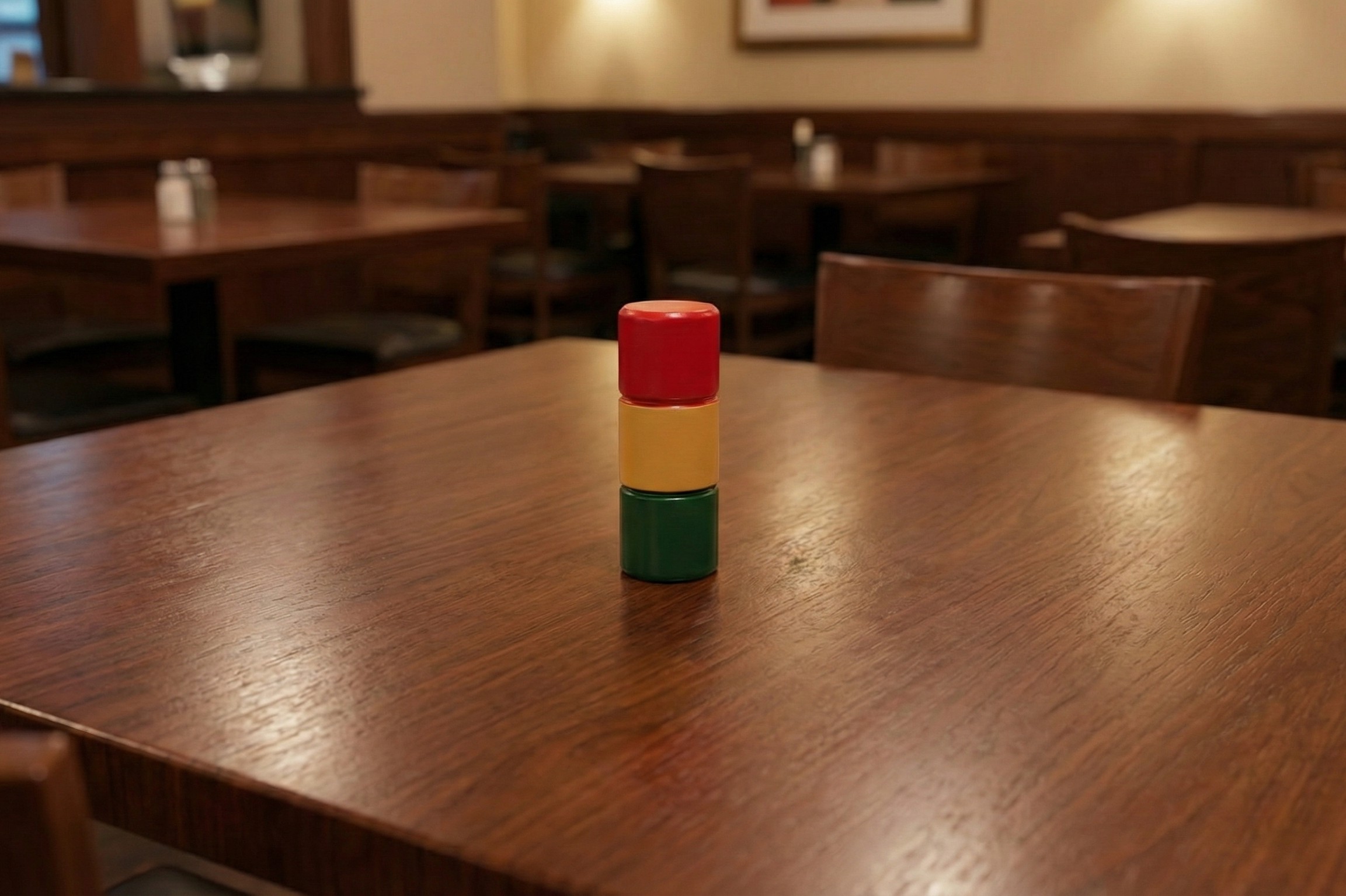
Here's the indicator from that dinner. If you look carefully, you can spot it on the table in the picture of my grandparents. However, at most Brazilian steakhouses, they use a larger, more visible, 3-d indicator. The chain Tucano's, for example, used to use something like this.
The Speaking Peg
My grandma's a tactful woman who's also interested in our lives. She doesn't want to pry, and is fully aware that sometimes well-meaning questions, "How's school going?" or "Are you still dating that girl?" can sometimes be unwelcome. Several years ago, she thought it would be good to incorporate the meat indicator into our conversations. She'll put it on the table, and if someone asks a question you don't want to answer, you can just turn it over. She calls it the 'Speaking Peg', and it makes family gatherings a little more inclusive and a little less awkward.
This has become such an important part of our family culture that we even got her one for Christmas one year.
Into the Digital Age
The world is changing, and everyone uses smartphones. Instead of carrying cameras, we use our phones. At church, instead of carrying physical scriptures, most people I see use a bible app. Other physical items, like boarding passes, have been mostly replaced with smartphone features.
My grandma will often bring the 'speaking peg' with her in her purse. However, a couple of weeks ago, she texted us a picture of it, realizing she could just use her phone instead. This got me thinking... Maybe I could build an app to emulate the speaking peg.
App Development
I've wanted to build and publish a smartphone app for a long time. It just feels like something you should do if you want to consider yourself a developer (which I do). A couple of years ago I set the goal for myself to build an app and publish it somewhere.
I started by drawing a prototype of the app in Microsoft Paint.
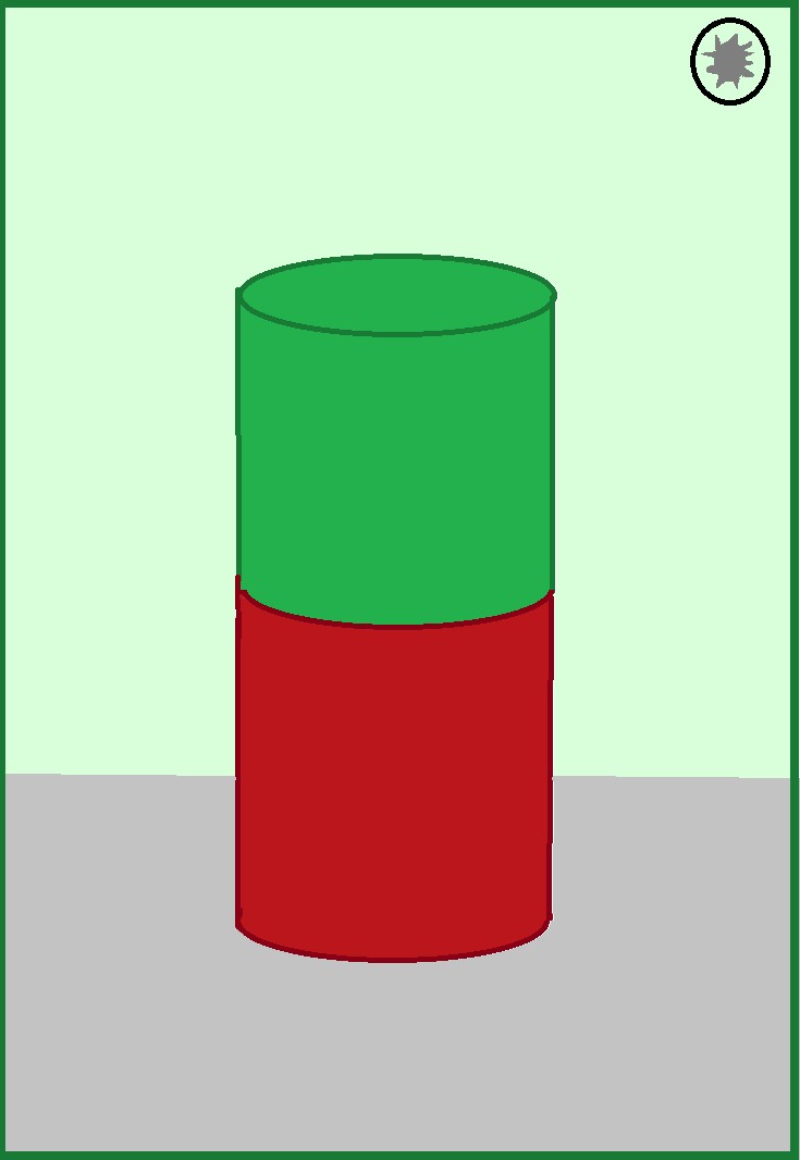
The drawing was simple, but so was my concept for the app. I decided to try and implement my app in React Native using three.js for the physics/rendering of the peg. I've used some of these tools before when I've built web-based stuff either for work or personal projects, and I was confident I could implement something as simple as a spinning cylinder.
User Experience
Even though I don't consider myself much of a 'UX guy', I've actually done a lot of work on user experience. Some of this was at an old job, some was learned in classes, and a lot came from my work on game development. While I'm far from perfect, I feel like I have a pretty good idea of what is intuitive to people, and what they might want when it comes to an app experience.
For example, the first version of the app had a floating cylinder that would rotate 180 degrees when you tapped the screen. That was great, but as I was playing with it, I tried swiping. I didn't like that the peg didn't spin in the direction of the swipe, so I added that feature.
The peg was just sort of there. In order to give it a little more tangibility, I gave it a shadow which moves in real time with the peg. This caused a lot of issues and took me several hours, but it was worth it. In addition to giving the peg more physicality, it also sent the user an implicit signal about which side of the peg was on the 'ground.'
To further increase the tangibility of the app, I added haptic feedback. When you flip the peg over, the phone vibrates just a bit to send home the message, "You just moved an object."
I also wanted it to always be immediately clear what color was 'up' from a glance. To enable this, I dynamically tinted the background, corresponding to the active color. A light green tint means, "We can keep talking about this" and a red tint means "New topic please."
Of course, you can't expect everyone involved in a conversation to be looking at your phone the whole time. How could I signal a flip of the peg?
The answer was to incorporate sound. I needed two sounds, one for flipping to green and another for flipping to red. I did a little bit of psychoacoustic research. The sounds needed to inherently signal, 'Yes' or 'No'.
I put a little music theory into the chimes, and came up with a high-pitch rolled major triad on the glockenspiel for the 'Yes' chime. For the 'No', I used a low, double note on the dulcimer. The 'Yes' chime is in A major, and the 'No' plays an F#, which is the tonic of the relative minor. A combination of the pitch and note choices and the qualities of the instruments, I felt like each chime clearly signaled 'Yes' or 'No'.
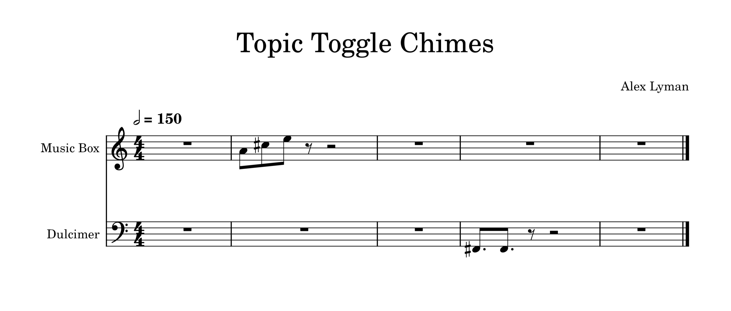
Give them a listen:
Settings
Users love to customize their experience while using an app. Settings are really important for that reason. I made pretty much every feature able to be toggled on or off.
I also added the ability to keep the screen from timing out and turning off. To conserve battery life, I added a dark mode. I made sure to still tint the background in dark mode to a subtle green or red.
I wanted the app to have a distinct look. Out of the box, it used default fonts, so I went to Ray Larabie's public domain fonts and picked out one I liked. After that, I needed to design an icon.
The Icon
At first I wasn't sure what to do for the icon. Could I just screenshot the app, crop it to a square, and be done with it?
Probably not. I looked through every app icon on my phone, and realized that most of them were stylized vector images. While I'm not an amazing artist by any definition, hubris carried me to Figma to create an icon.
Honestly, I was floored it turned out as good as it did. I exported the icon as a background and foreground layer to take advantage of Android's dynamic icons, and I was getting close to done.
The Name
Of course, the app needed a name. I brainstormed for a while. The name needed to be short, catchy, and signal to a user what it was meant for. After working on it for longer than I expected, I decided on Topic Toggle. Renaming the app was a hassle. It broke all the code (there were lots of references to the old name), but I eventually got it sorted out.
Testing
I tested the app a bunch by myself, but that's not enough. I had my wife mess around with it, and she gave me feedback on the sounds and other aspects. Then I had my brother come over and test it on his iphone to make sure it worked there as well. After testing, I was ready to publish the app. I had gotten it to run successfully on both iOS and Android devices, and from there I thought it would be as simple as exporting the app and uploading it.
Publishing the App
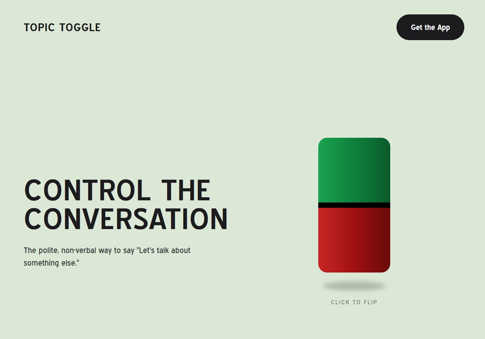
As I mentioned earlier, I've always wanted to publish an app. I looked into it, and publishing apps is really expensive and takes a long time. Both the Apple App store and the Google Play store mandate a weeks of testing across several devices. On top of that the app store forces developers to pay $99 a year just to have a developer account, and I wasn't going to drop hundreds of dollars on this silly idea for my grandma. I decided to self-publish on my own website.
If I was going to self-publish, I needed a dedicated page for Topic Toggle. I made one, being sure to make it a little visually distinct from my main site. I based the icon, fonts, and color scheme off of the app.
This app is mostly a joke, but I thought it would be funny to take the site as seriously as I could. I tried to make it look like a real website for a real app. I even had AI help me write the 'founder story' blurb for the site. While I never use AI for my writing, in this case I wanted to create something really corporate and soulless, so I had Gemini write the first draft for me, and tweaked it from there.
Apple is Terrible
However, you can't self-publish an iOS app. Apple won't let users install apps from anywhere other than the app store. A few years ago, the EU passed the Digital Markets Act to put an end to this monopolistic behavior. Japan passed a similar law, the The Smartphone Software Competition Promotion Act (SSCP). So you can download third-party apps on iphones in Japan and Europe. However, these laws aren't in effect in the USA, so the only way for me to distribute this as a full-fledged mobile app would be to line Apple's pockets, which I refuse to do.
Exporting Apps is Terrible
Exporting the app for Android should've been easy, but every time I tried, something else broke. Even though the app worked perfectly in the test environment, something went wrong whenever I tried to make it work. I spent at least 10 hours exporting, testing and debugging to no avail. After all that I was almost ready to give up.
But at this point, I'd spent over 20 hours on the app and I wasn't about to drop the project entirely.
The Workaround
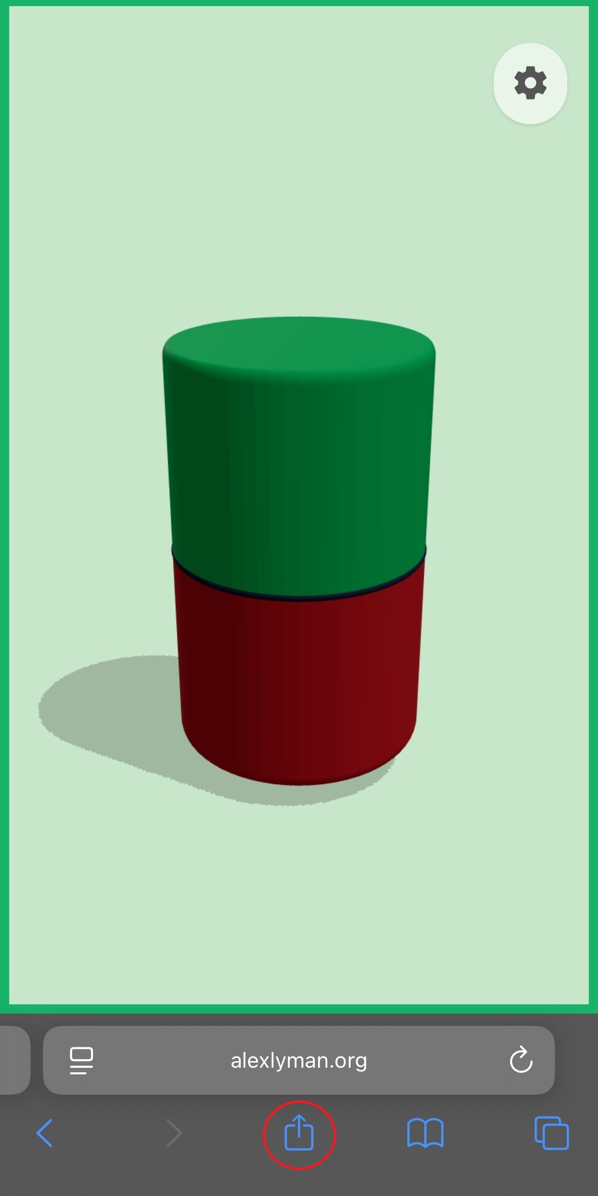
Since I built the app in React Native, I could do a web build. It wouldn't have all the features of the mobile app. Web browsers are very choosy about what features they allow a website to use. I had to get rid of the brightness controls. Then, I had to get rid of the haptics. (Technically, there's a JavaScript Vibrations API, but not many browsers honor it.) So this was the best I could do given the constraints. You can try the web version here.
If properly configured, webapps can be installed on a phone as something called a Progressive Web App. I did some work to let users save Topic Toggle to their home screen. Even though it's not perfect, it's pretty close to what I initially imagined.
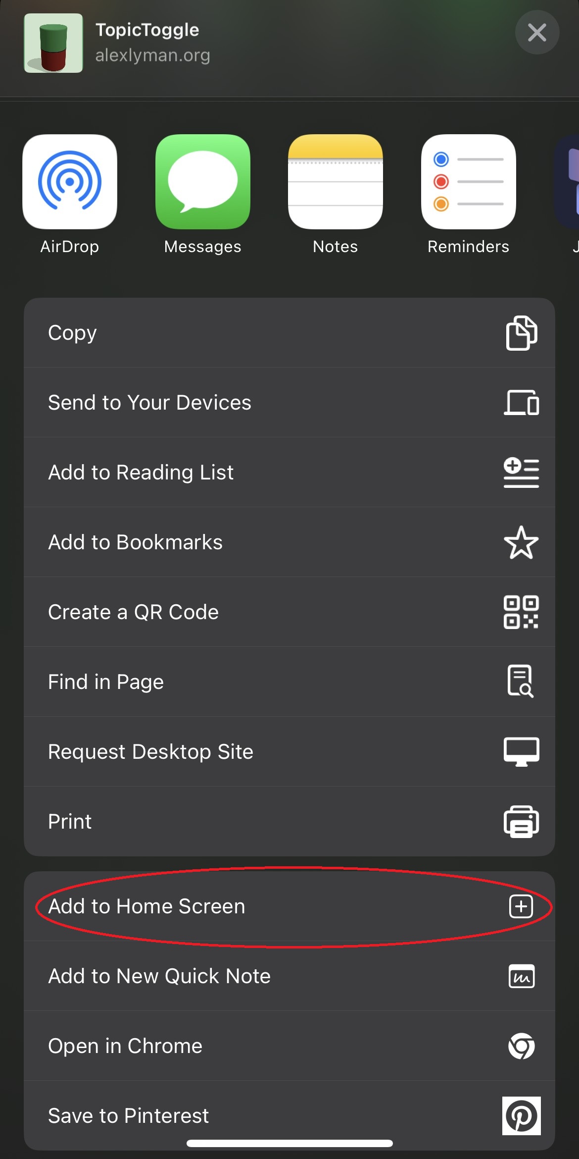
How to Save Topic Toggle as an App
iOS
After navigating to the Topic Toggle webapp, tap the Share button (box with arrow). Then, scroll down and tap "Add to Home Screen".
Android
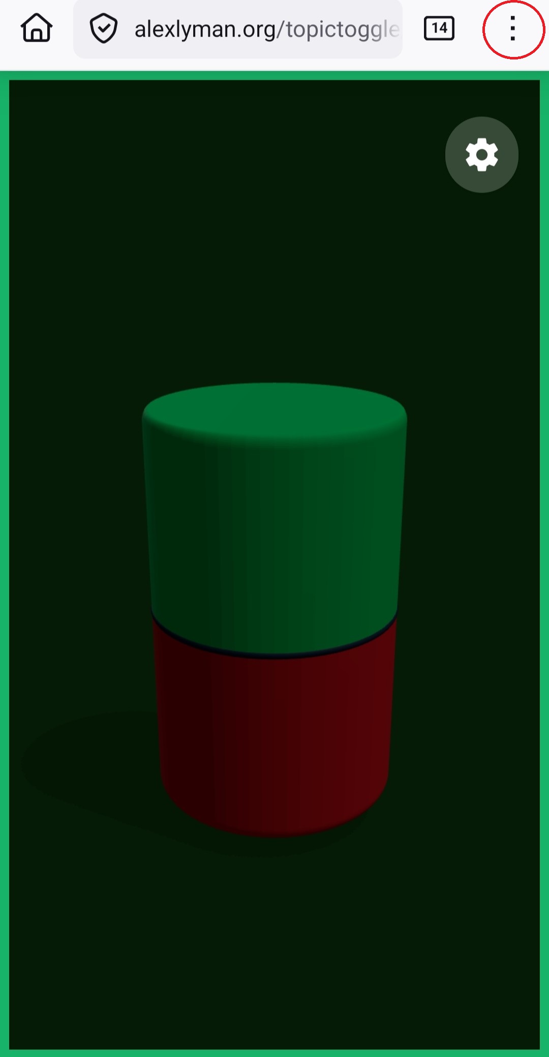
Once you've navigated to the Topic Toggle webapp, tap the three dots at the top-right hand corner. Then, tap "Add to Home Screen".
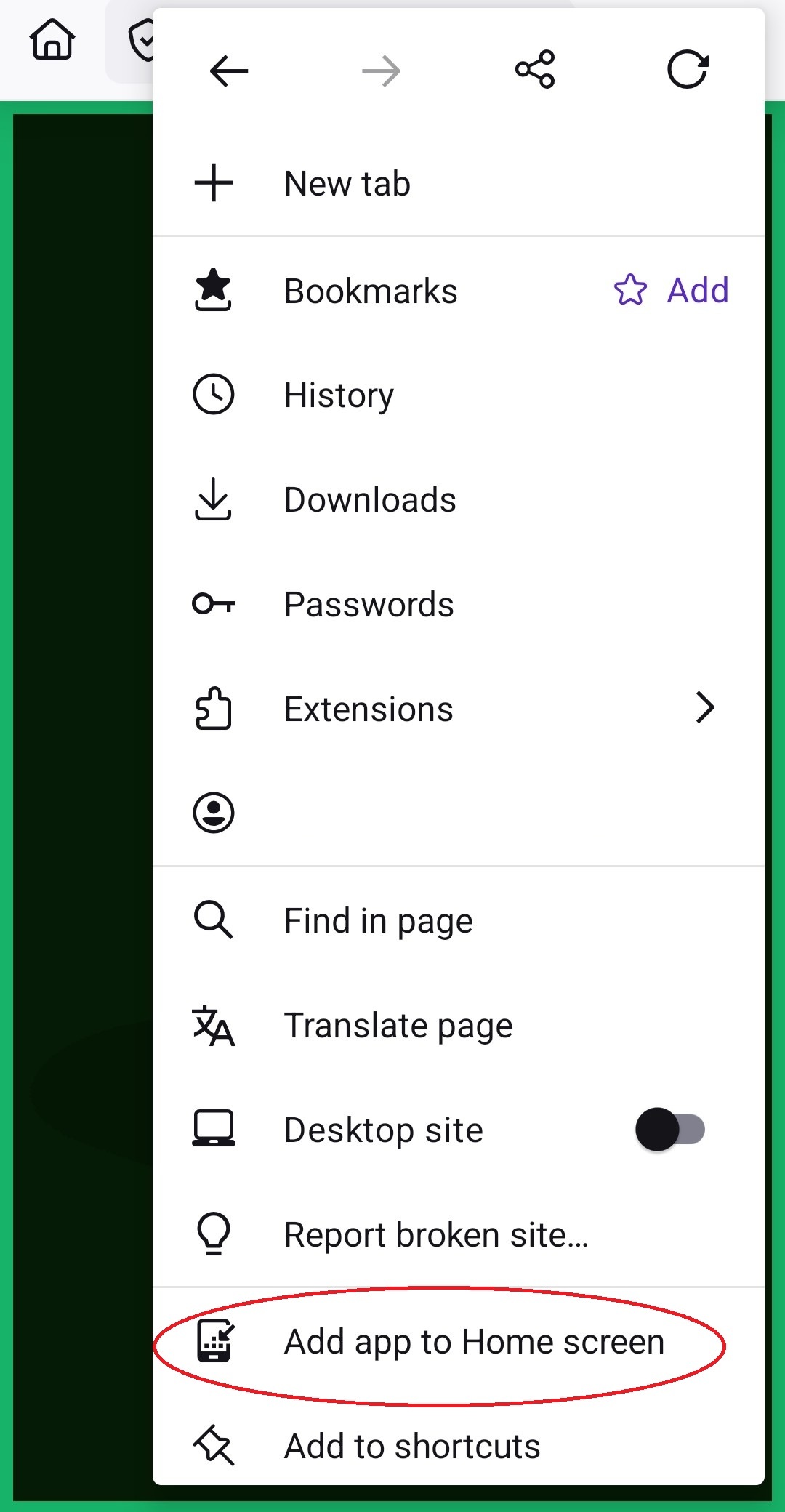
Depending on what browser you use (on both iOS and Android), your screen might look a little different, but the steps should be the same.
Conclusion
It was great to meet a longstanding personal goal of mine by publishing an app. The road was longer and harder than I anticipated, but the end result was worth it. On top of that, I made something that's (hopefully) even a little bit useful in real life.
Of course, you should try the app yourself. Check it out on the official site.